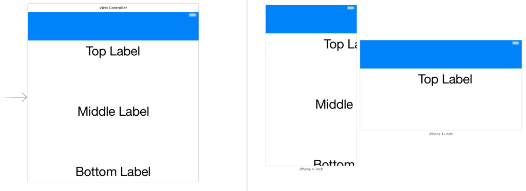
I’m a big fan of Auto Layout in iOS. However, in the beginning trying to use Interface Builder to create a responsive layout with Auto Layout was particularly challenging. Things just didn’t work the way you expected in Xcode 4:
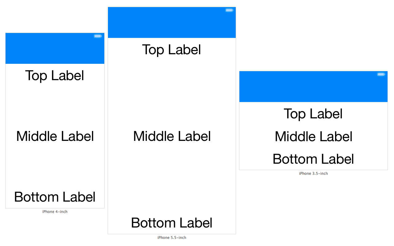
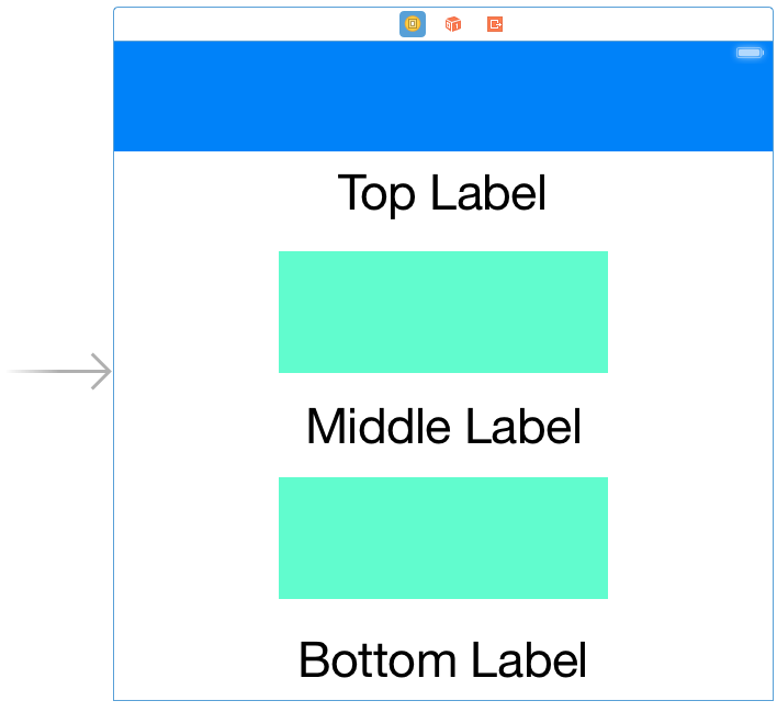
I found Xcode 5 actually made Auto Layout fun and Xcode 6 has made it even better. Whilst all the tooling advances help, implementing seemingly simple layouts are often not obvious. It’s important to develop an understanding of common layout patterns to apply when using Auto Layout. To that end, in this post I’m going to cover how to evenly space views. What we’d like to achieve is three labels that are evenly spaced regardless of the size of the labels or where they appear in their superview. This will allow our view’s layout to respond appropriately on different screen sizes and to events like a banner sliding down, a keyboard sliding up, or an interface rotation:
Getting Started
So we create our three labels in Interface Builder. We also add a banner view at the top of the view. If you haven’t used Interface Builder’s Preview feature you should definitely try it now. Simply open the Assistant Editor and choose the Preview option from the Jump Bar. Without any constraints yet, the results are predictably un-useful:
Spacer Views
To solve this we need a way of telling Auto Layout how to control the space between the three UILabel instances. In order to do this we’ll use spacer views. These will be hidden UIView instances which give us the ability to specify constraints for our spacing. These spacer views won’t be visible to the user but they will participate within the Auto Layout system.
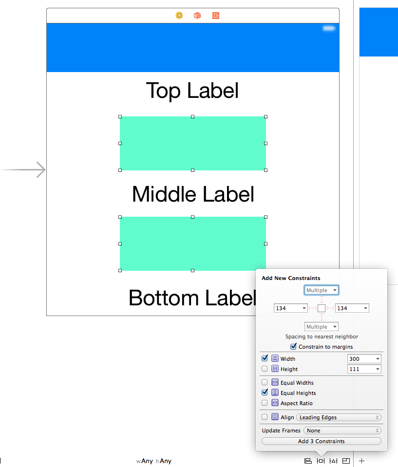
The key constraints required here are for equal heights on the spacer views. We also specify a constant width for the spacer views:
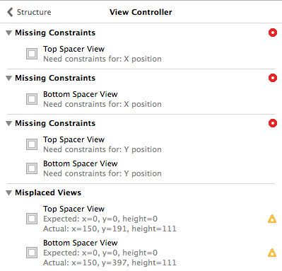
Having equal heights for the spacer views ensures their height is always equal and thus the spacing between our labels will also be equal. Of course just adding those constraints is not enough to satisfy Auto Layout:
Spacing the Spacers
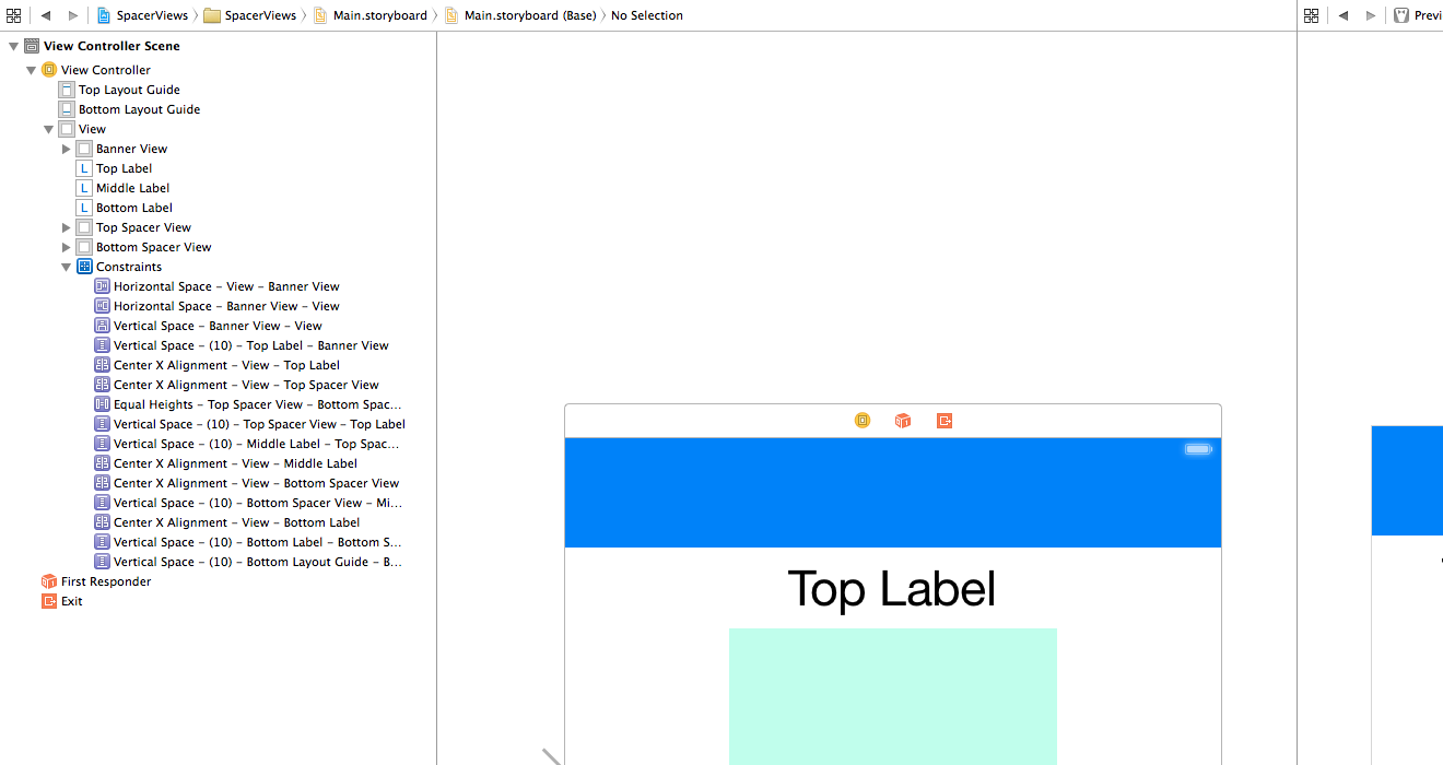
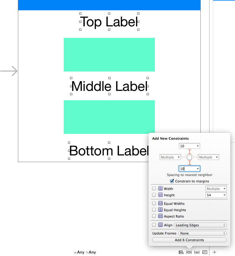
Now we want to add some vertical spacing between our labels and spacer views. Select all three labels and both the spacer views and then add vertical space constraints with a constant of 10:
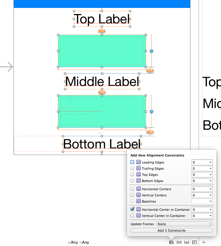
We also need to specify a constraint so Auto Layout knows how to position these views horizontally. We’ll just make them all centered:
Final Constraints
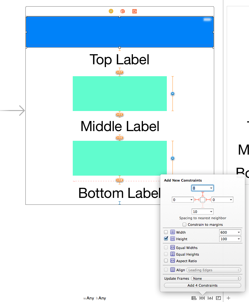
Finally we need to add constraints for our blue banner view at the top of our view. We’ll just pin the banner’s height, left, right, and top space:
 Wrapping Up
Once all these constraints are in place you can set the spacer views’ hidden property as YES. Finally make sure you update all the frames in Interface Builder so your view’s layout reflects its constraints. Your view should now have no Auto Layout warnings or errors. The source code for this post is available here.
2 thoughts on “Evenly Spacing Views in Auto Layout”