When I first started using Auto Layout, I found it particularly frustrating that previously simple layouts seemed so much harder to implement. So now I find it especially rewarding when Auto Layout makes previously difficult or tedious layouts trivial. One such example is responding to the appearance of the system keyboard. In this article I’ll show you a simple approach for adjusting layout in response to the system keyboard as Apple recommends:
When asked to display the keyboard, the system slides it in from the bottom of the screen and positions it over your app’s content. Because it is placed on top of your content, it is possible for the keyboard to be placed on top of the text object that the user wanted to edit. When this happens, you must adjust your content so that the target object remains visible.
Auto Layout and the Keyboard
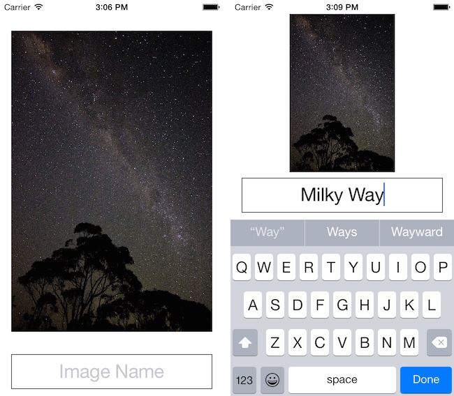
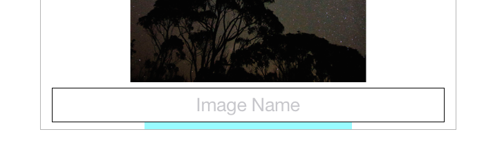
To demonstrate this I’ve made a simple app that shows a picture and a text field. The text field contains the editable name of the picture.
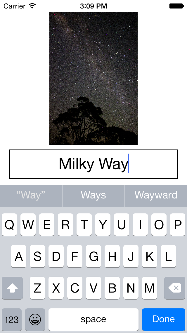
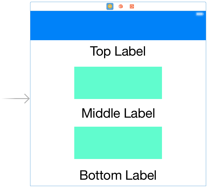
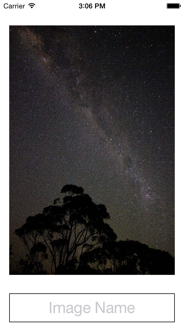 When the keyboard is displayed the view’s layout should look like this:
Auto Layout – Constraints
There’s several important aspects for this layout:
- The image should always maintain its original aspect
- There is always a minimum 8 point vertical space between the image and the text field
- There is always a minimum 10 point vertical space between the text field and the keyboard
Additionally we want to animate the view’s layout changes when the keyboard is shown and hidden. So to get started we need to add a UIImageView:
Then set its contentMode to ScaleAspectFit
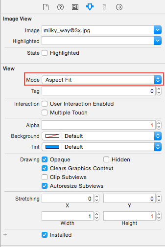
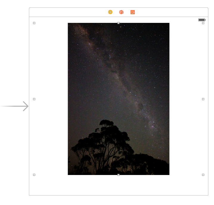
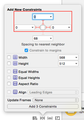
Pin the left, top, and right to its superview’s margins:
To finish the views we add a UITextField and a hidden UIView. The hidden UIView is a space view. It allows us to specify a constant padding between either the bottom of the view or the top of the keyboard:
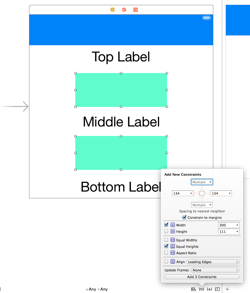
For the UITextField we pin its top, 8 points to the bottom of the UIImageView. Its left and right are pinned to its superview’s margins. It’s bottom is pinned to the spacer view’s top. Finally we give it a constant height of 50 points:
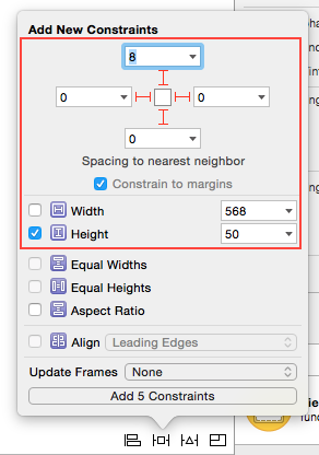
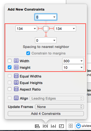
The final constraints required are for the spacer view. We don’t care about the width so we just pin its left and right to its superview’s margins. Its bottom is pinned to the bottom layout guide. Its height is 10 points which ensures the padding we require.
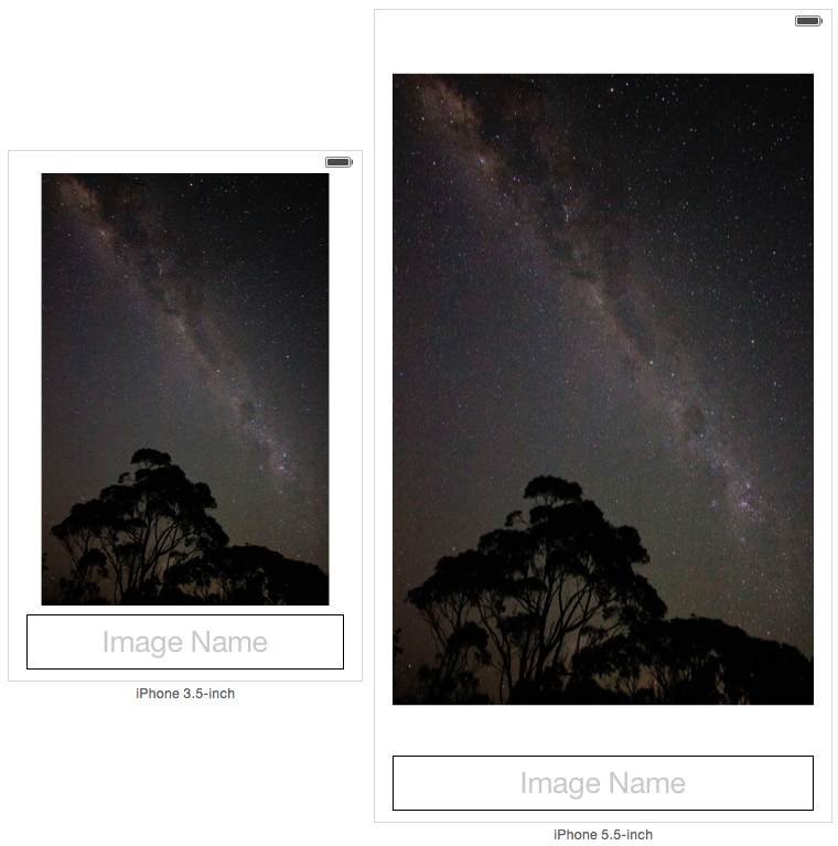
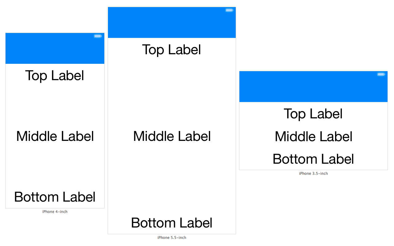
At this point we’ve set up our views and all their required constraints. Looking at Preview in the Assistant Editor our layout looks good on both a 3.5 inch display and a 5.5 inch display:
Auto Layout – Animating
We’ve achieved a layout that is correctly adjusting to devices with different widths and heights. This is great, because all we need to do now is adjust the space between the spacer view and the bottom layout guide. This is done by adjusting the constant property on the corresponding NSLayoutConstraint.
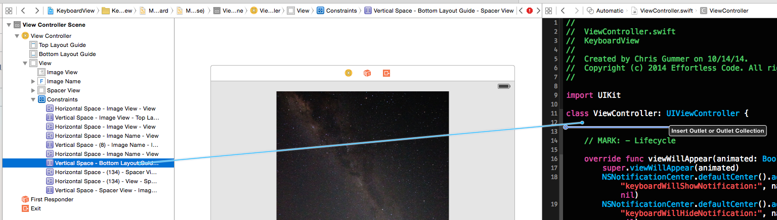
Adjusting the constant value will be done in code in response to the keyboard being shown or hidden. First the constraint needs to be connected from the storyboard to our UIViewController subclass. This is done by control clicking and then dragging from the constraint between the spacer view and the bottom layout guide:
Now we’re ready to write the code required to make everything functional. In order to respond to the keyboard being shown and hidden, we need to listen for the appropriate UINotification objects. We add observers in viewWillAppear and remove them in viewWillDisappear. This ensures we start observing once the view appears and stop once it disappears:
|
1 2 3 4 5 6 7 8 9 10 11 12 13 14 15 |
@IBOutlet weak var bottomLayoutConstraint: NSLayoutConstraint! // MARK: - Lifecycle override func viewWillAppear(animated: Bool) { super.viewWillAppear(animated) NSNotificationCenter.defaultCenter().addObserver(self, selector: "keyboardWillShowNotification:", name: UIKeyboardWillShowNotification, object: nil) NSNotificationCenter.defaultCenter().addObserver(self, selector: "keyboardWillHideNotification:", name: UIKeyboardWillHideNotification, object: nil) } override func viewWillDisappear(animated: Bool) { super.viewWillDisappear(animated) NSNotificationCenter.defaultCenter().removeObserver(self, name: UIKeyboardWillShowNotification, object: nil) NSNotificationCenter.defaultCenter().removeObserver(self, name: UIKeyboardWillHideNotification, object: nil) } |
Next, we implement the functions that the notifications will call. These are simple functions that simply re-route to a function that will handle the layout update for us:
|
1 2 3 4 5 6 7 8 9 10 11 12 13 14 15 16 17 18 19 20 21 |
// MARK: - Notifications func keyboardWillShowNotification(notification: NSNotification) { updateBottomLayoutConstraintWithNotification(notification) } func keyboardWillHideNotification(notification: NSNotification) { updateBottomLayoutConstraintWithNotification(notification) } // MARK: - Private func updateBottomLayoutConstraintWithNotification(notification: NSNotification) { let userInfo = notification.userInfo! let animationDuration = (userInfo[UIKeyboardAnimationDurationUserInfoKey] as NSNumber).doubleValue let keyboardEndFrame = (userInfo[UIKeyboardFrameEndUserInfoKey] as NSValue).CGRectValue() let convertedKeyboardEndFrame = view.convertRect(keyboardEndFrame, fromView: view.window) let rawAnimationCurve = (notification.userInfo![UIKeyboardAnimationCurveUserInfoKey] as NSNumber).unsignedIntValue << 16 let animationCurve = UIViewAnimationOptions.fromRaw(UInt(rawAnimationCurve))! |
The NSNotification object contains useful data about how the keyboard will be displayed. We’re interested in the keyboard’s animation duration and its animation curve. This data tells us how we should animate our layout changes. The notification also contains the frame that this keyboard will have at the end of the animation. Pulling these constants out is mostly straightforward.
However, the animationCurve requires us to jump through some hoops. In order to animate the change to the constraint’s constant, we’ll be using the class method animateWithDuration:delay:options:animations:completion: on UIView. In order to specify the animation curve we pass in a UIViewAnimationOptions value to this method. This is a mask of options as defined in UIViewAnimationOptions. In particular the values for animation curves must be shifted to the left by 16 bits. Once we have the shifted value for the animation curve, we then use the fromRaw function onUIViewAnimationOptions struct to get the value we need.
|
1 2 3 4 5 6 |
bottomLayoutConstraint.constant = CGRectGetMaxY(view.bounds) - CGRectGetMinY(convertedKeyboardEndFrame) UIView.animateWithDuration(animationDuration, delay: 0.0, options: .BeginFromCurrentState | animationCurve, animations: { self.view.layoutIfNeeded() }, completion: nil) } |
To accommodate the space where the keyboard will be, we need to adjust our bottomLayoutConstraint’s constant. Effectively we want the constant to be 0 when the keyboard is not visible. When the keyboard is visible we want the constant to reflect the space from the bottom of our view to the top of the keyboard. To calculate the constant we just need CGRectGetMaxY(view.bounds) - CGRectGetMinY(convertedKeyboardEndFrame). After updating the constraint’s constant, the final step is to animate the layout change.
That’s it! Apart from some boiler plate code to interact with the keyboard notification, adjusting our layout boils down to a single line of code that changes a constraint’s constant. The full source for this project is available here.
